Urbane Update
DESIGN NJ JUNE/JULY 2018 ISSUE
A 1938 Summit home gets a chic makeover for a transplanted Manhattan couple.
Moving from the big city to the ’burbs doesn’t mean you need to lose your edge. After making the transition from Manhattan to Summit, Becky Johnson and Juan Arias called on designer Valerie Grant to translate their metropolitan style to their new surroundings. The result was a sophisticated update to the 1938 Colonial-style home they purchased—one that suited their modern preferences and also befitted the home’s gracious setting.
“They definitely wanted something that felt young and urban,” Grant says. Johnson approached her after seeing her design work during a Summit-area benefit kitchen tour. Grant invited the couple to her own home so they could view her aesthetic translated through an entire house. They hired her almost immediately.
“I wanted a modern, clean look,” Johnson recalls. “But I didn’t want my couches to be so low that I couldn’t get up. That’s not me. I wanted it to be livable.”
The redesign began with the kitchen, which needed some renovation. Grant worked in collaboration with kitchen designer Susan Obercian to transform the layout and aesthetic of this space. Arias and Johnson felt the existing center island was awkward and needed a new layout. There also were two sets of French doors on an exterior wall that left the room cold and drafty in winter. By removing one set of doors, they could regain control over the room’s temperature and reclaim floor space in front of those doors.
“Everyone loves a white kitchen. I feel white rooms need something to balance them. Different fabrics tie the color story together.” – Valerie Grant
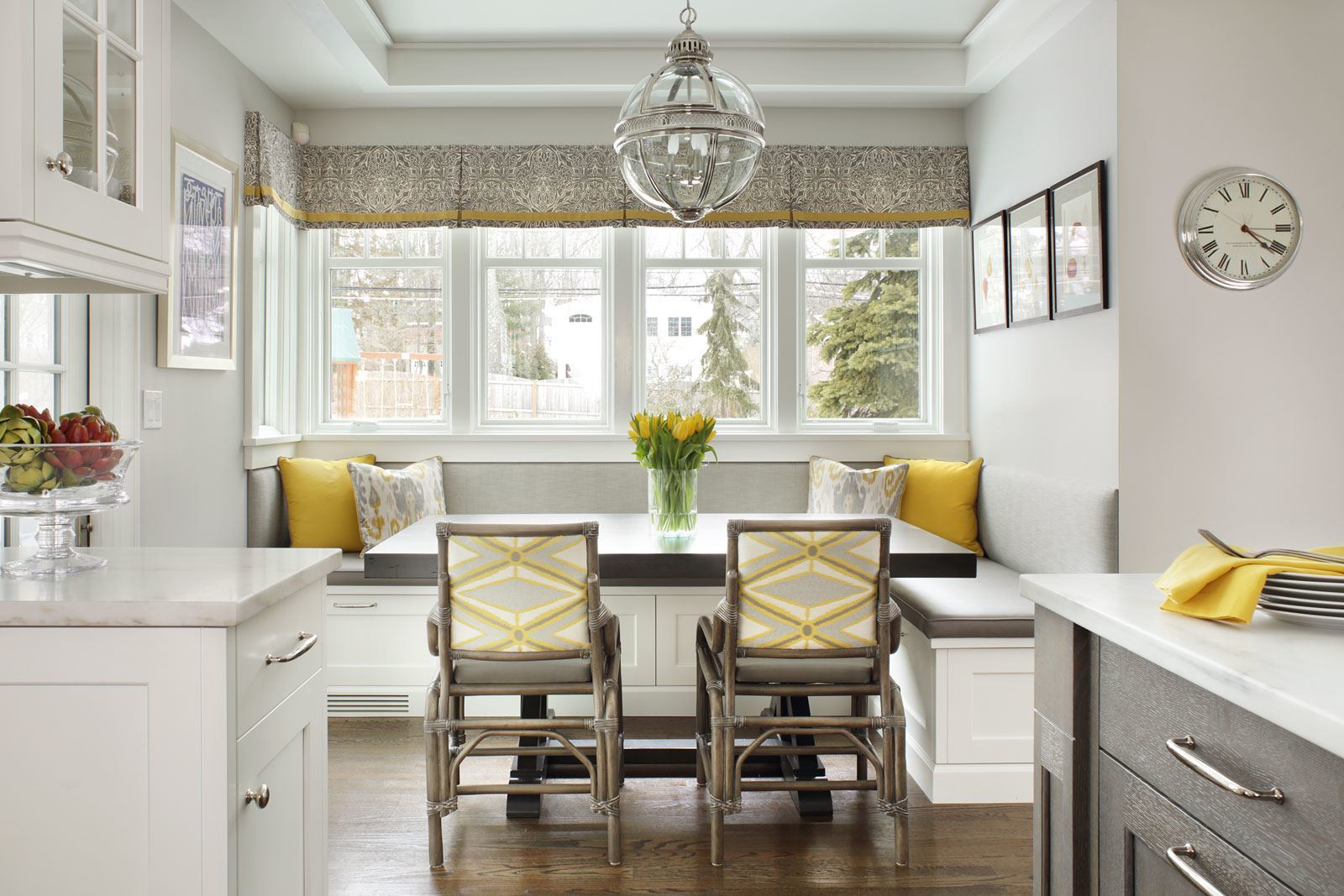
The couple and their young son moved out of their home for about four months during the construction. Workers gutted the existing light-brown cabinetry and green countertops, replacing them with white cabinets and honed Vermont Danby marble. A mudroom was added adjacent to the kitchen, and a new breakfast area took shape along the wall where the superfluous set of doors once stood.
The remodeled kitchen was far more functional, and its design introduced a new quality and character to the home. The all-white look was decidedly more modern. And Grant veered into the avant-garde with the introduction of soothing warm grays accented with sun-drenched yellows. The new island is gray-stained oak, while the fabrics in the breakfast nook incorporate dark and light grays as well as vibrant yellows.
“Everyone loves a white kitchen,” Grant says. “I feel white rooms need something to balance them. Different fabrics tie the color story together.”
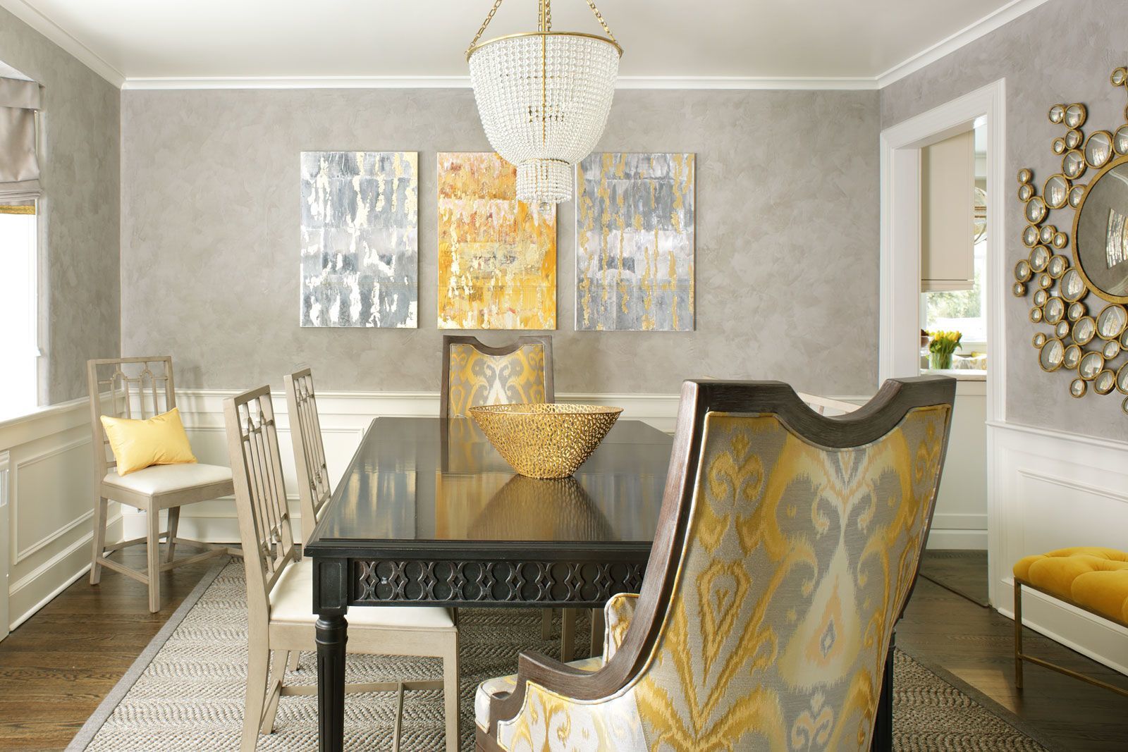
Grant pulled the yellow and gray into the adjacent dining room, elevating them to gold and silver in numerous touches that ramp up the glamour quotient. A beaded chandelier sparkles over a transitional table while the host chairs at the ends gleam with a shimmering taupe-and-gold ikat-design fabric. The walls above the wainscoting are finished in Venetian plaster, and upon them are hung contemporary art canvases and a sculptural mirror.
Grant’s background is in fashion so her design approach tends to start with the blending of fabrics. But she also has a propensity for mixing materials, especially elements that are more refined with those that are more organic. “When you push one aesthetic too far, the design loses personality,” she says.
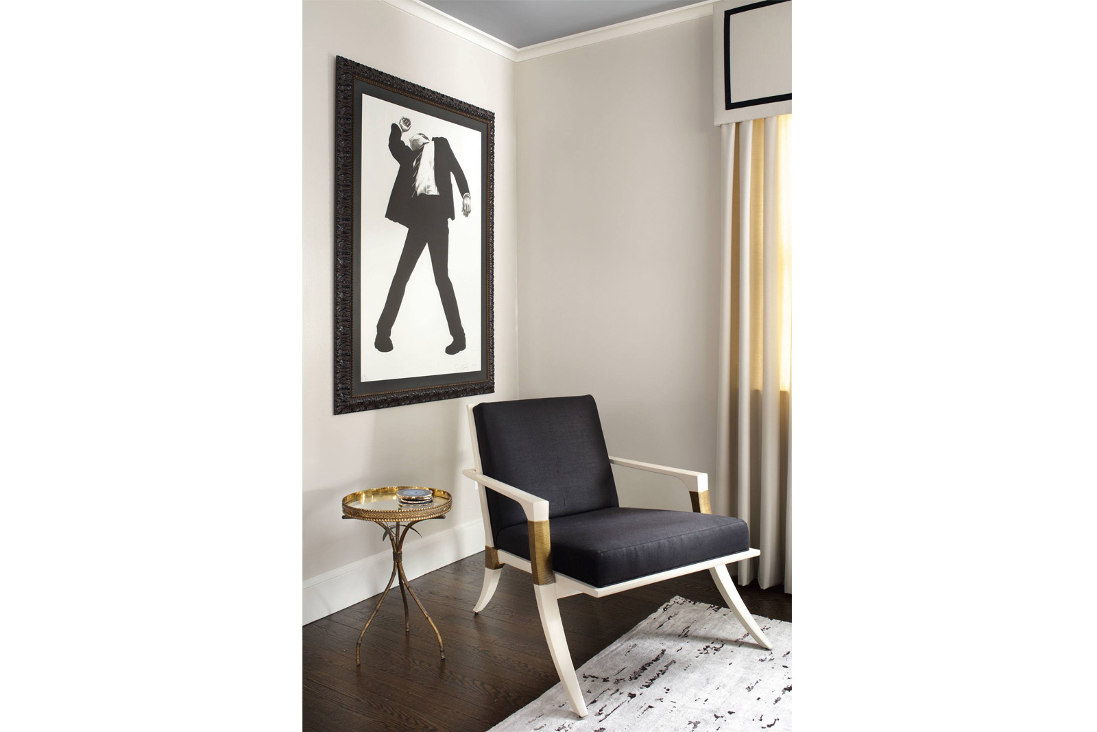
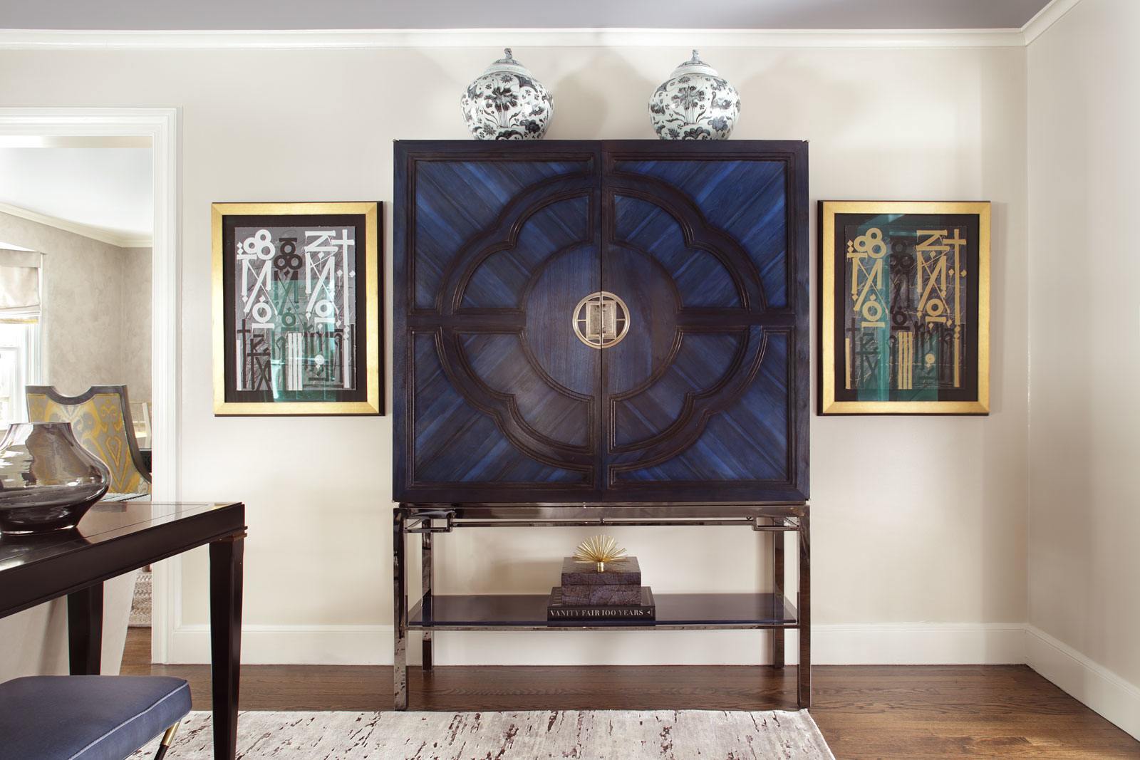
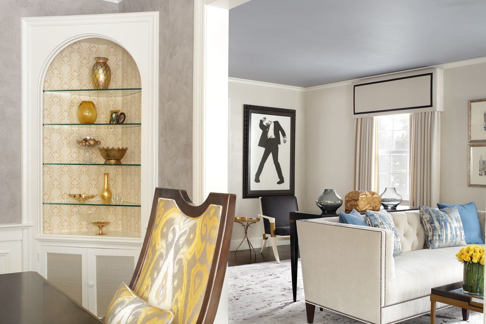
The living room is a study in that sort of balance. Dark accents and a smoky ceiling painted in a pearl-finish gray offset white walls and furnishings. The sleek lines of the sofa and tables steady bolder, graphic elements throughout the room, including a Sputnik-style chandelier. Grant added personality to an otherwise monochromatic palette with the addition of blue fabrics and a stunning lapis-blue cabinet—a statement piece if ever there was one. “When she showed us that, I couldn’t have been more excited,” Johnson says.
Johnson and Arias were happy to give Grant the leeway to take those types of risks. “We really trust her, and I love her taste,” Johnson says. “Everything has some original detail to make it different, but something we won’t get sick of.”
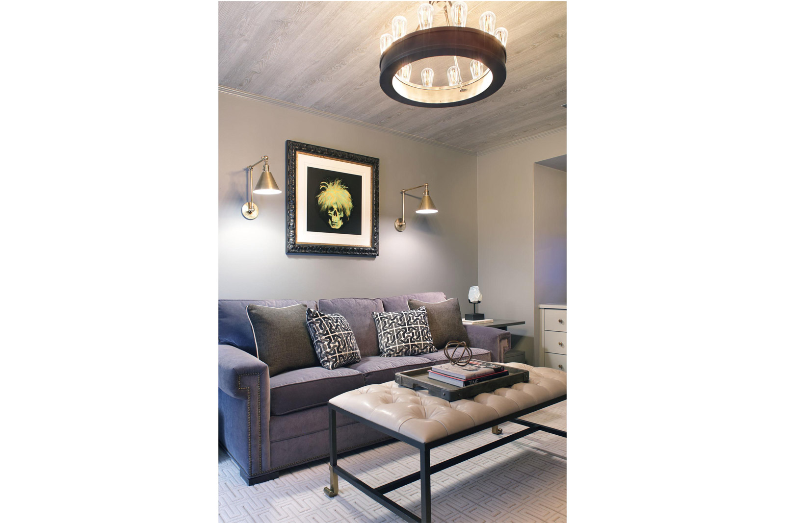
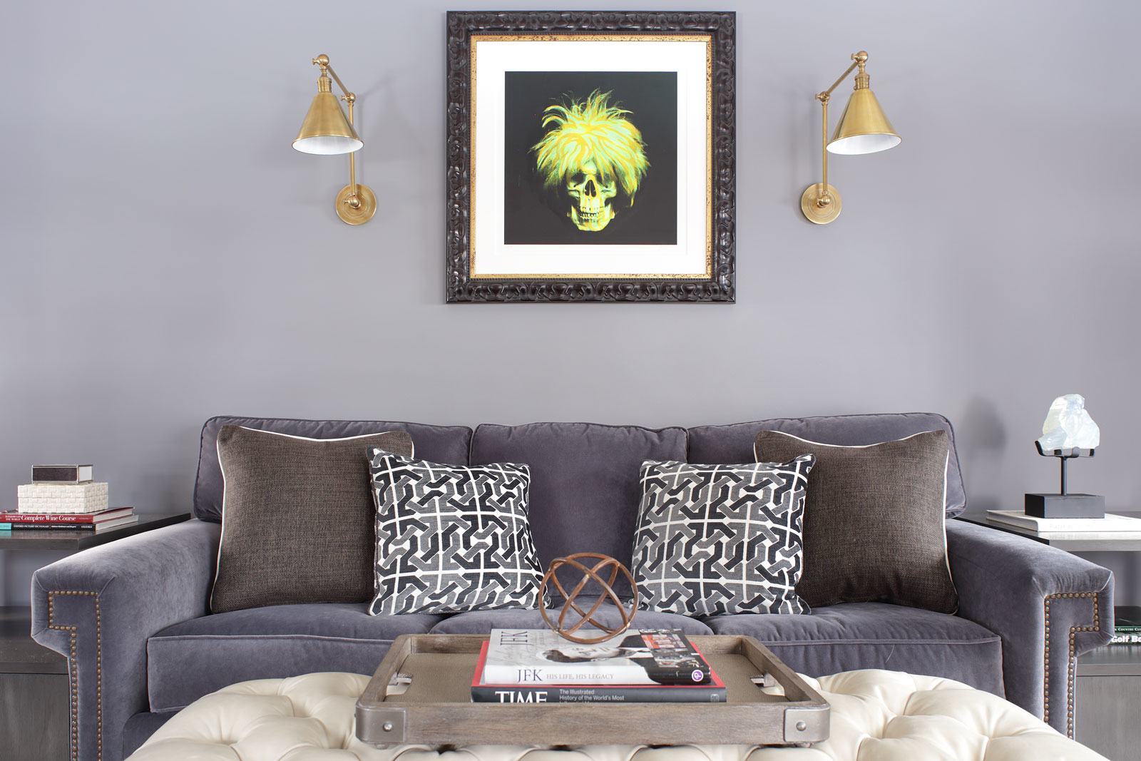
A favorite room is the office, which also serves as a guest room and a “man cave” for Arias, who sometimes works from home. The room has a cool vibe with gray walls, gray lacquer cabinets that fill the dormer spaces and a modern industrial-style chandelier. Hanging above a smoky charcoal sofa is Ron English’s Andy Warhol tribute, Figment. But the real standout is the ceiling, which is covered with wood veneer wallpaper. “That’s a bold move, to put wallpaper on the ceiling,” Johnson says. “People love it.”
Not all clients give a designer such freedom, Grant notes. But on the occasion that it does happen, it can lead to some unexpected and exciting results. “It allows you to be a little more creative,” Grant says. “You can have something special—exceed the client’s expectations. They couldn’t believe their house could become something that people who live in much grander homes would be happy to have.”


