I was so thrilled to have this Hudson Valley Modern Farmhouse featured in both Homes & Gardens UK and Aspire Design & Home magazines. I would love to take you through the journey of transforming this incredibly special project.
The first time I arrived at this home, situated on 90-acres in Dutchess County, NY, I was in awe of the unique setting and natural beauty. At our first meeting, my clients shared their vision to create a home that their active family of 5 could settle into upon their return from a 2 year stint “across the pond”. They entrusted me to work with the eminently talented Jimmy Crisp of Crisp Architects and Josh Rich of Home Enrichment Company to embark on a complete renovation and expansion of this 5 bedroom, 5.5 bath home.

The goal was to take this 8,700 square foot home built in 1998 (although it looks like it has been situated on top of this hill forever) and open up the smaller rooms to take advantage of its glorious setting by emphasizing the views both from the interior spaces and outdoor areas. The renovation included reconfiguring the interior layout, opening up the kitchen and family room, incorporating plenty of windows, adding bedrooms with ensuite bathrooms and redesigning outdoor areas for seating and entertaining. All to be done coordinating long distance with the clients!
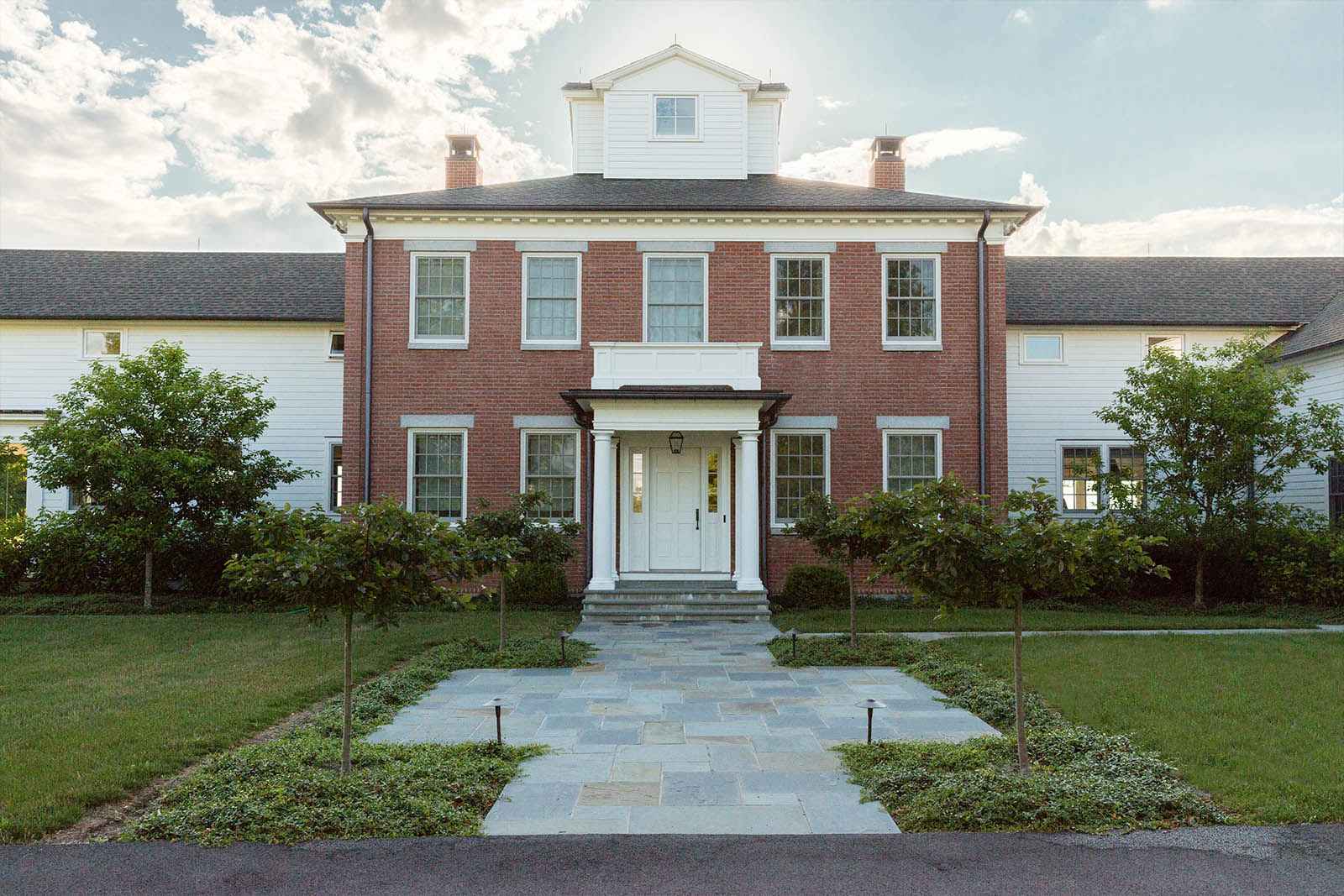
So, when we completed this project and the clients came back to see it for the first time, we were thrilled to have created a home that fit (and hopefully even exceeded) their expectations. I hope you enjoy the tour of this extraordinary home!
Foyer
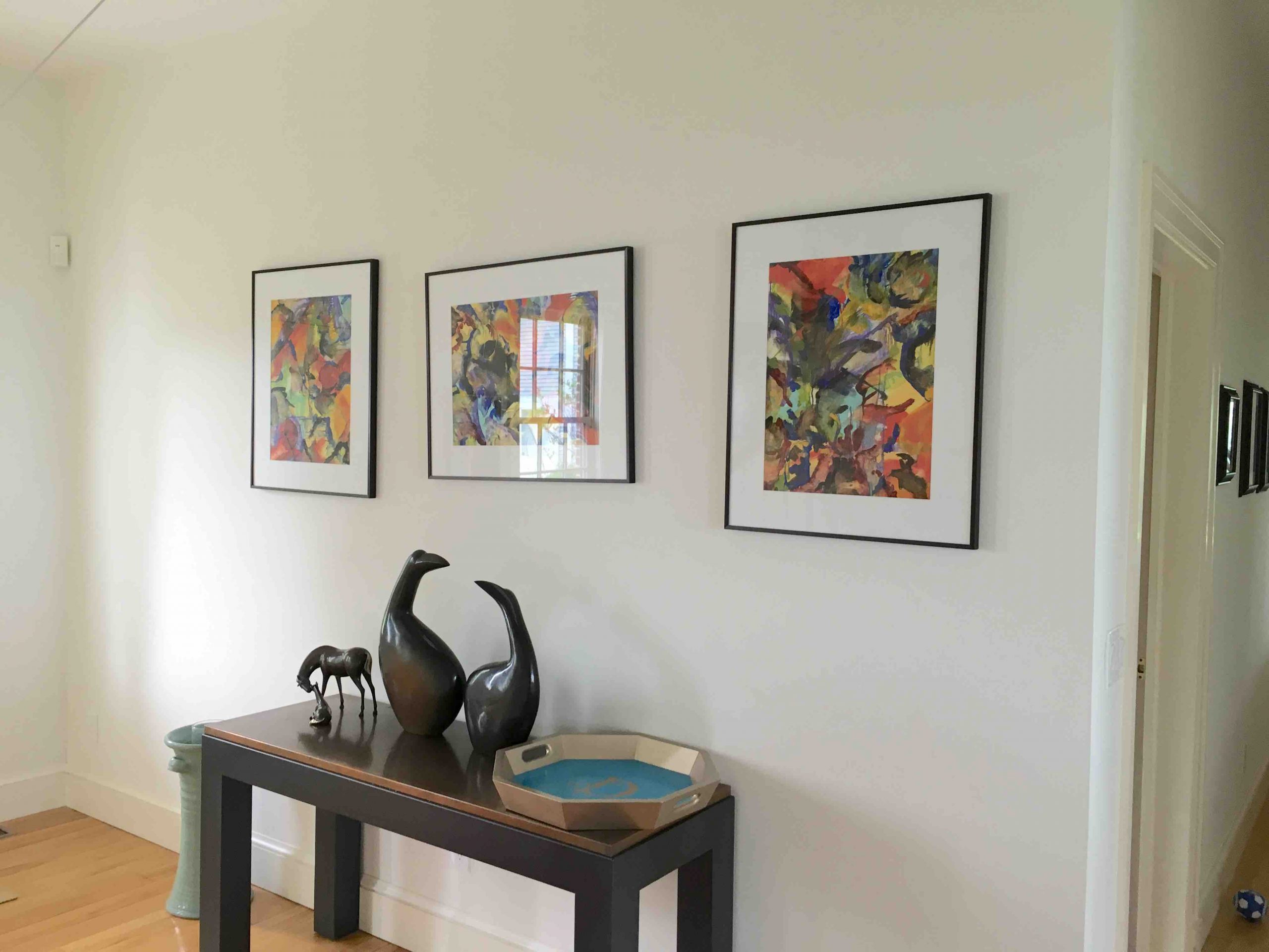
Perhaps the most important space in a home – the foyer – is where the aesthetic is set. Here, we created a clean, crisp entry with bright white walls and rich deep stained oak wood floors to welcome you into the home.
BEFORE

AFTER
Family Room
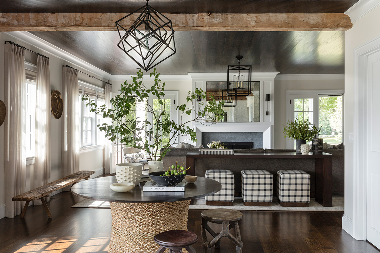
As part of the expansion of the open kitchen and family room, we used locally salvaged antique black walnut wood beams and a dark stained wood ceiling to make this area feel warm and inviting. The oversized sectional provides plenty of seating and the stools tucked under the console table offer additional seating options. We concealed the TV behind a custom antique mirror cabinet above the fireplace and designed a custom surround for the fireplace making it the centerpiece of this space. Using a neutral palette and a mix of textures and materials, we created an elevated yet approachable room to hold family movie nights, weekend hang outs or alternative study spaces. The round accent table provides a transition into the kitchen for after school snacks or a charcuterie spread when entertaining.
AFTER

AFTER
Kitchen
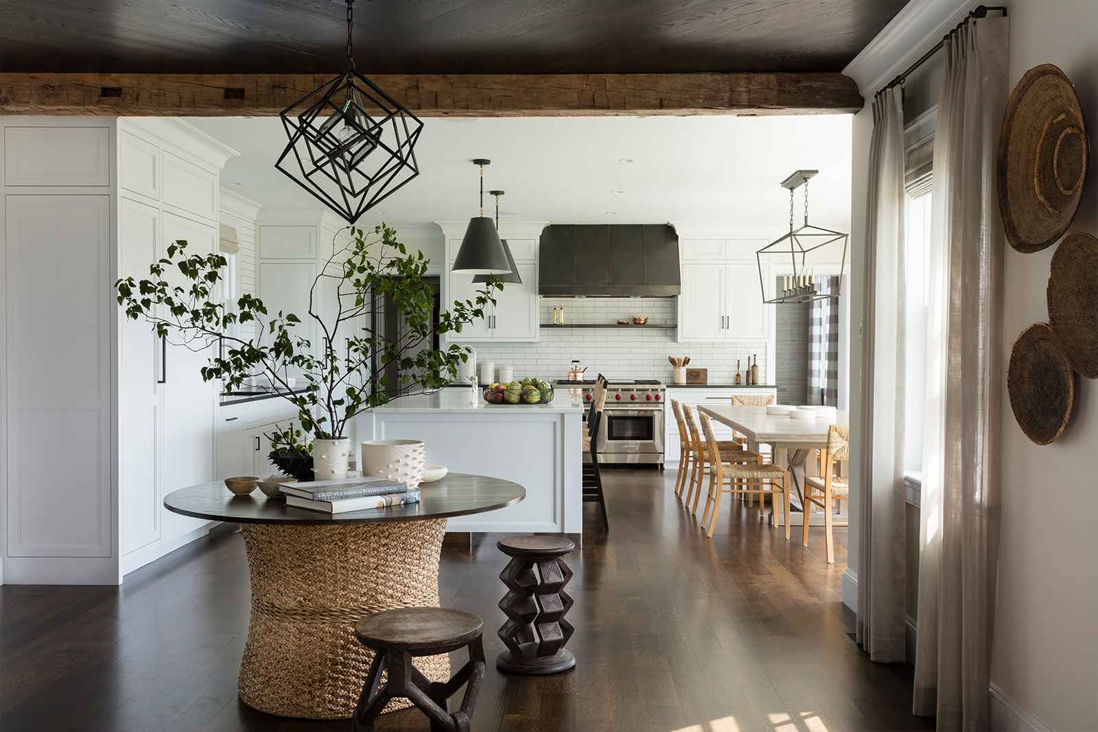
There are so many reasons why I love white kitchens – they are classic, timeless, and always look clean and bright. In this space, I particularly love the dramatic juxtaposition of the dark ceilings in the family room and the light ceilings in the kitchen. Although this is an open space, the rooms are clearly defined and have a cohesive yet distinctive feeling.
In the kitchen, the white cabinetry, tile backsplash and island countertop are offset by the black perimeter counter as well as the custom dark metal range hood and the sculptural light fixtures.
AFTER

AFTER
Living Room
Living rooms were once formal spaces that were rarely used. Our goal in transforming this space was to give this room a comfortable elegance to settle in for a quiet afternoon in front of the fire, enjoy a glass of wine before dinner or a relaxed family night.
The fireplace was enhanced with a navy textured wall covering and a new limestone surround finished by a custom designed metal edging with rivet detail. Custom built-ins were designed for the walls flanking the fireplace with open shelving and storage below. New crown molding was added for architectural interest. Another key design element is the custom designed mica ceiling fixture which serves as a focal point in the room.
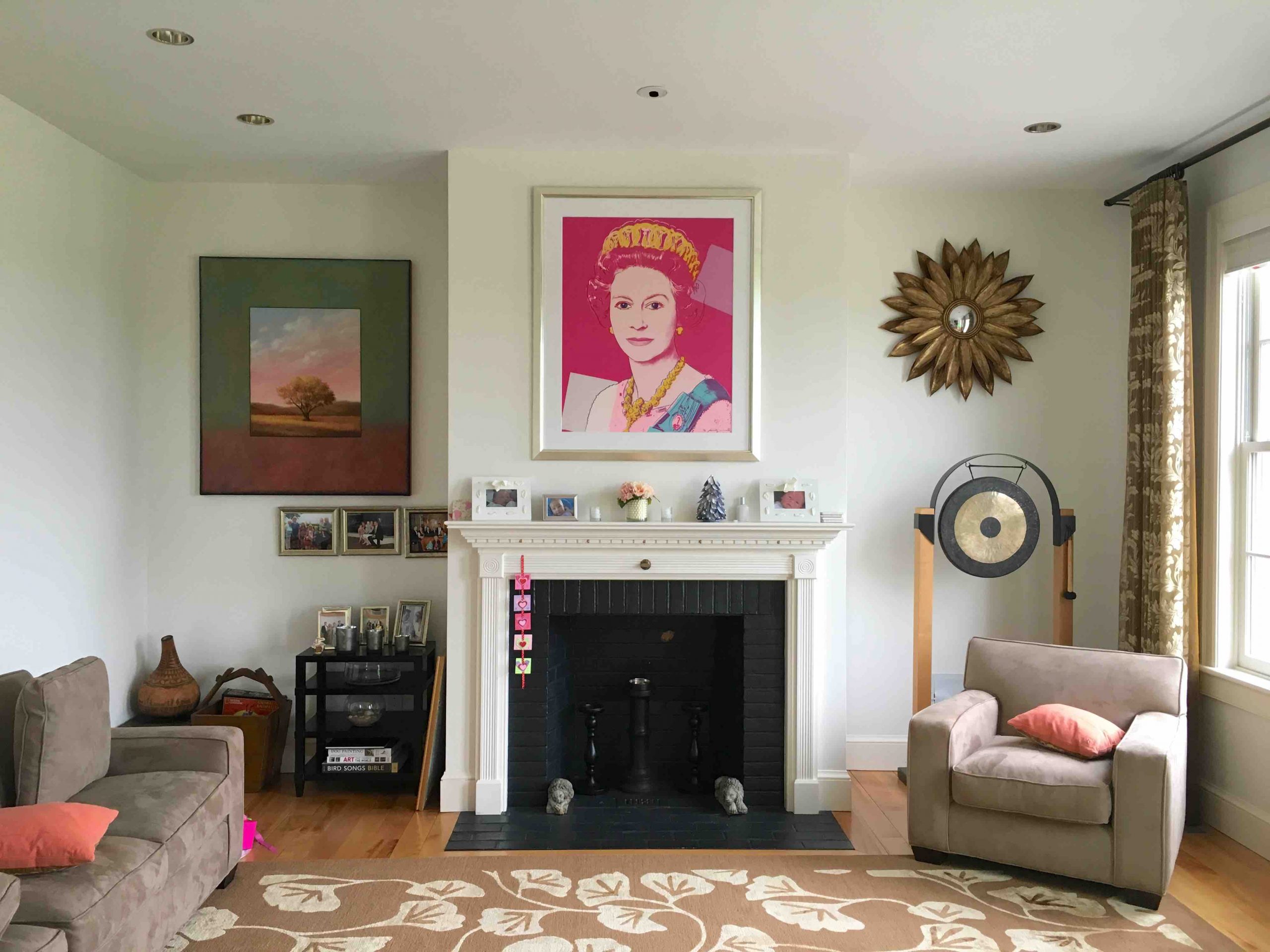
BEFORE

AFTER
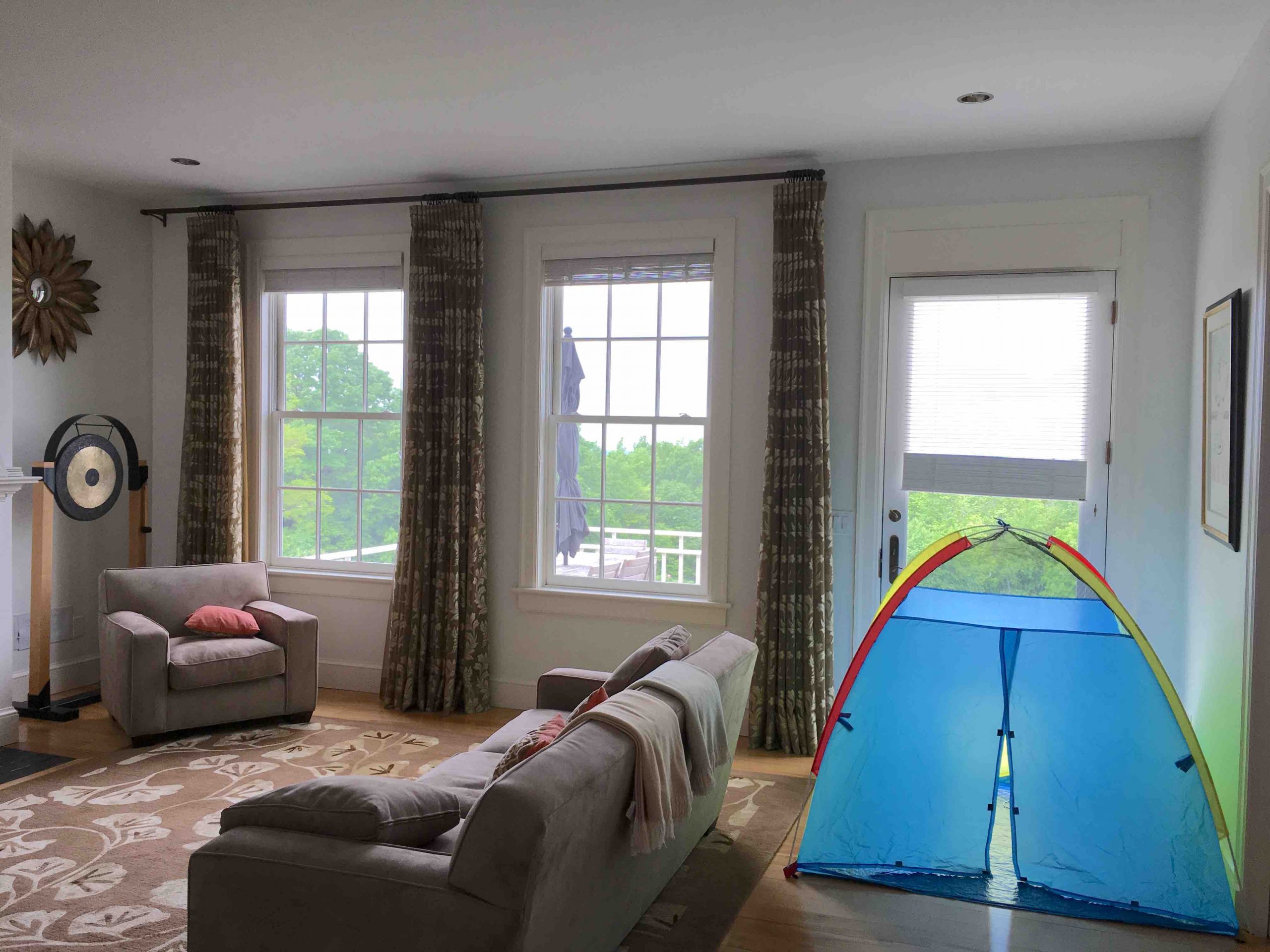
BEFORE

AFTER
Dining Room
The crown molding detail also carried through to the dining room. Further modifications to this room included softening the walls with a pale blue grass cloth wall covering complemented by sheer striped drapery panels. The new custom dining table and modern chairs are highlighted by a gorgeous organic ceiling fixture. This space was clearly enhanced with a number of changes, but the finishing touch was adding the clients’ artwork of Queen Elizabeth over the fireplace to personalize the space and add impact.
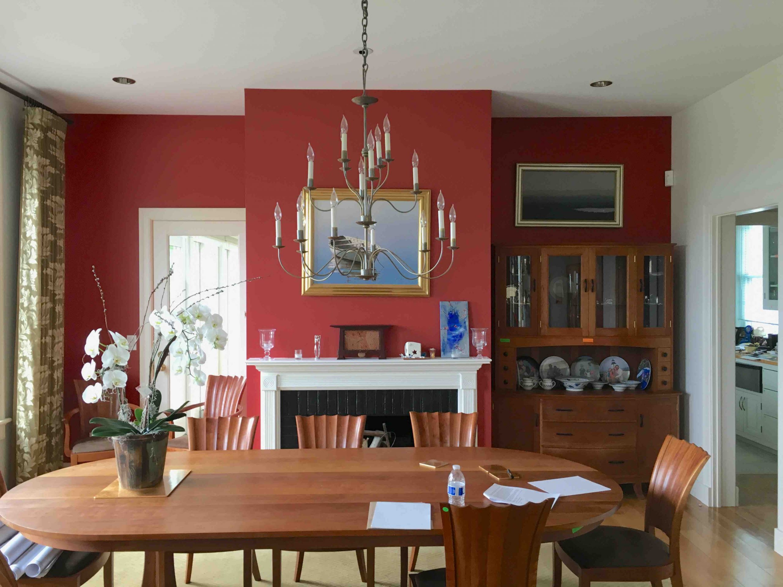
BEFORE
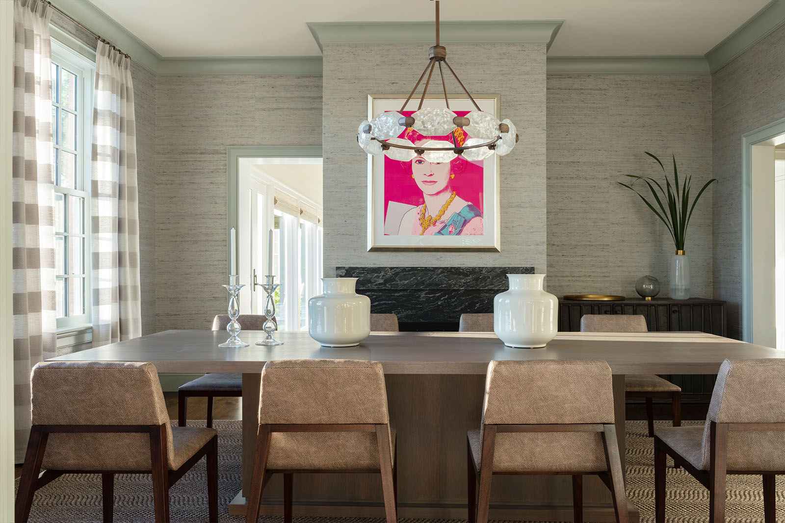
AFTER
Butler’s Pantry
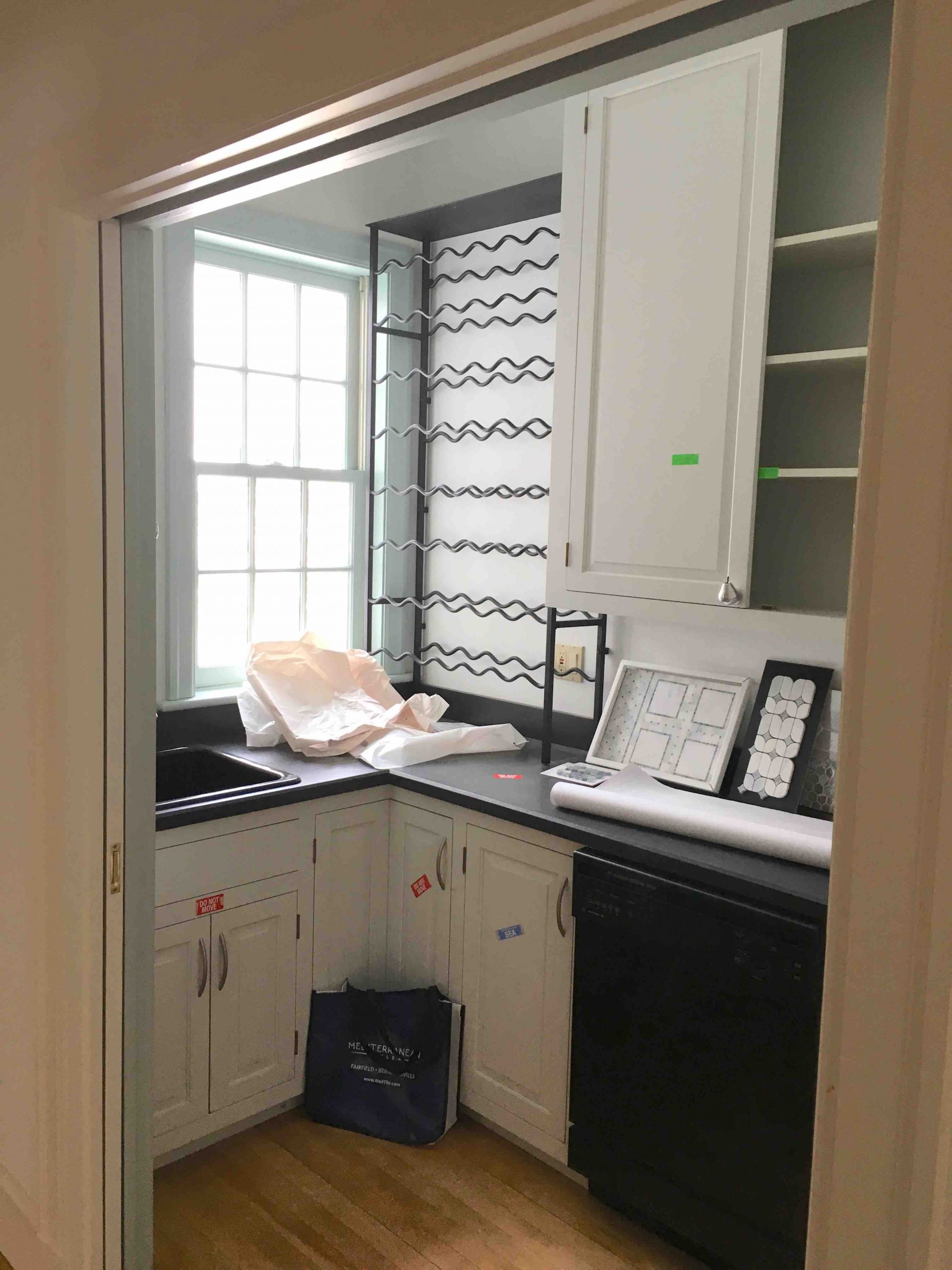
Butler’s pantries are one of the most enjoyable spaces to design. I love taking these often overlooked spaces and creating a moody alcove to mix up cocktails for the evening. The transition of this space began by adding new custom cabinetry and a new marble countertop accented with an antique mirror tile backsplash and a subtle patterned metallic wallcovering.
BEFORE

AFTER
His Office
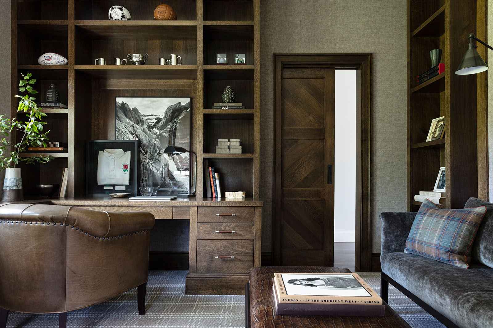
This room in particular shows off the incredible craftsmanship of the local, fourth generation cabinet maker who created all of the custom cabinetry for the home. The deep stained oak built-in desk surrounded by open shelving and accessible drawers for storage is complemented by the adjacent sofa that is tucked into shelves flanking either side. The client required an office to accommodate working from home (even before this was a thing) on a regular basis. By creating a dedicated desk area and a separate more comfortable seating area, there is plenty of space to move around and provide options for getting work done. A custom pocket barn door was added to make efficient use of all the wall space while providing much needed privacy.

BEFORE
AFTER
Her Office
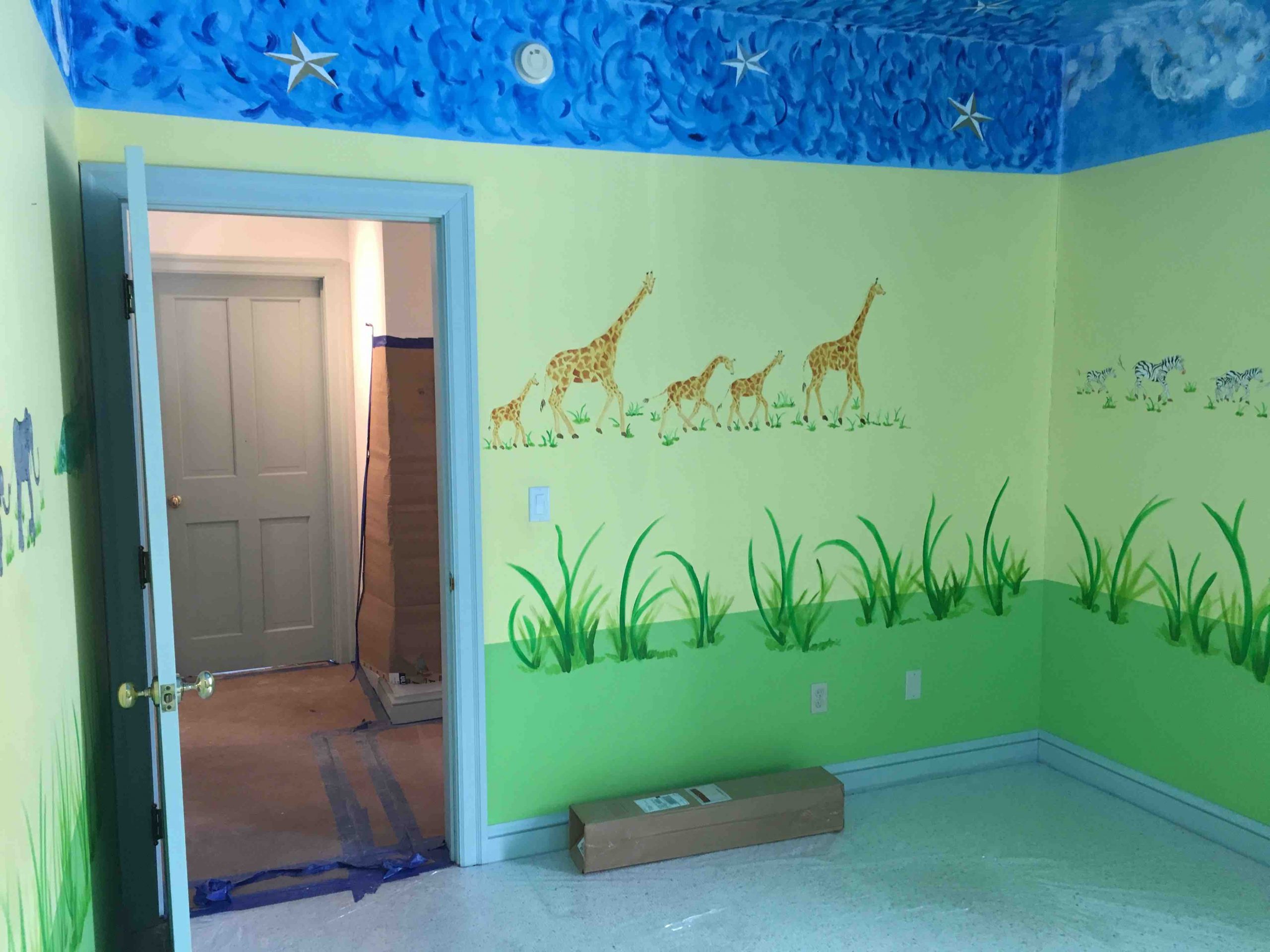
The transformation of this space reflects the changes in the family’s lifestyle. What was once a kid’s bedroom is now converted into a sophisticated home office for its artistic occupant. The abstract ceiling detail adds a graphic touch to the classic navy and white palette of the room. Here again, the custom built-in cabinetry is both functional and adds style to the space. The sculptural shape of the day bed adds another artistic detail and offers a comfy spot to relax.
BEFORE

AFTER
Powder Room
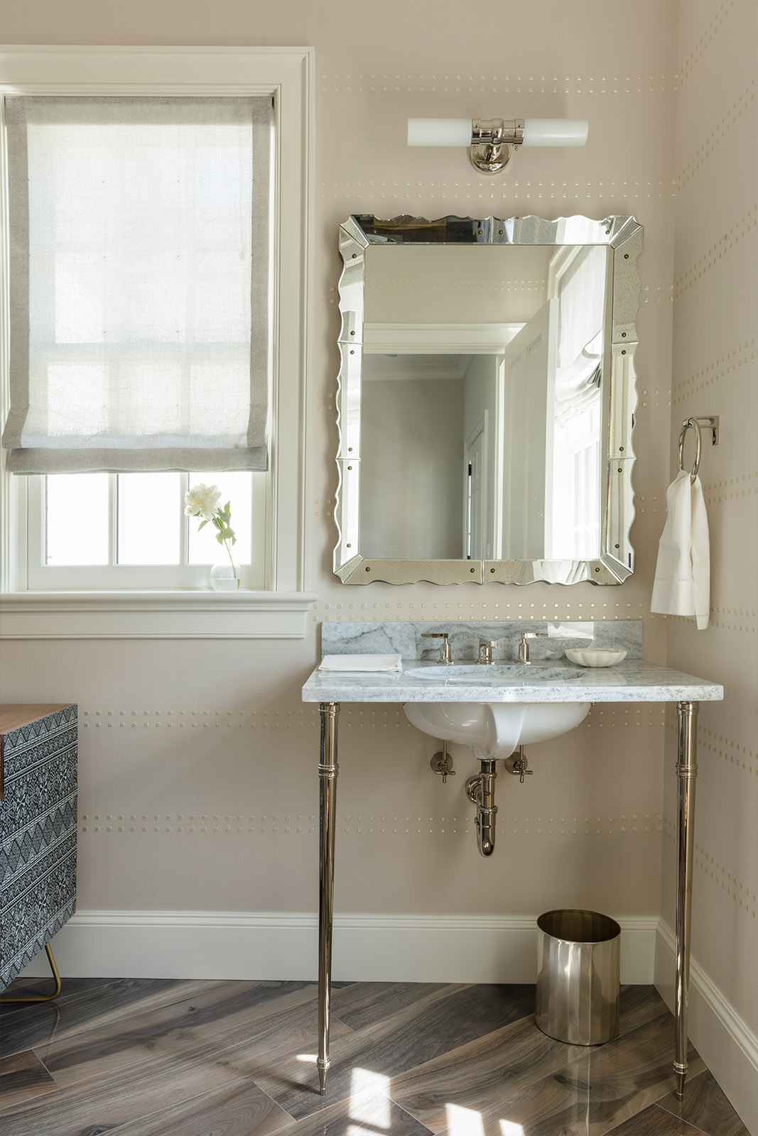
The exposed sink and antique inspired mirror create a clean lined aesthetic in this powder room. The rivet detailed wall covering and abstract veined stone flooring add a modern element that give the room an updated look.
AFTER
Master Bedroom
The window treatments in the master bedroom were selected to echo the abstract ceiling detail in her office. We carried through the elegant navy and white palette to create a sophisticated sanctuary with expansive windows that frame the breathtaking view.

AFTER
Master Bathroom
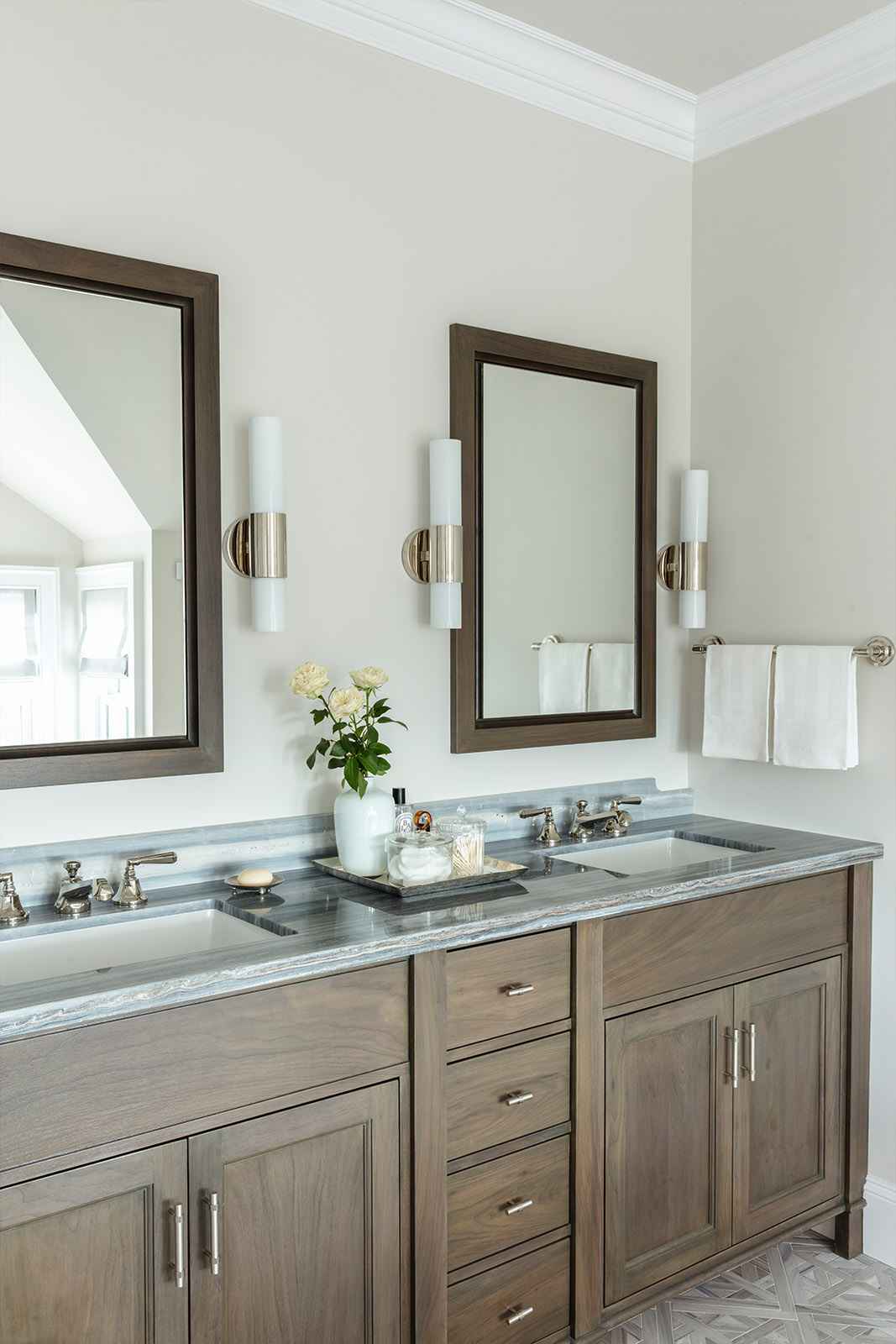
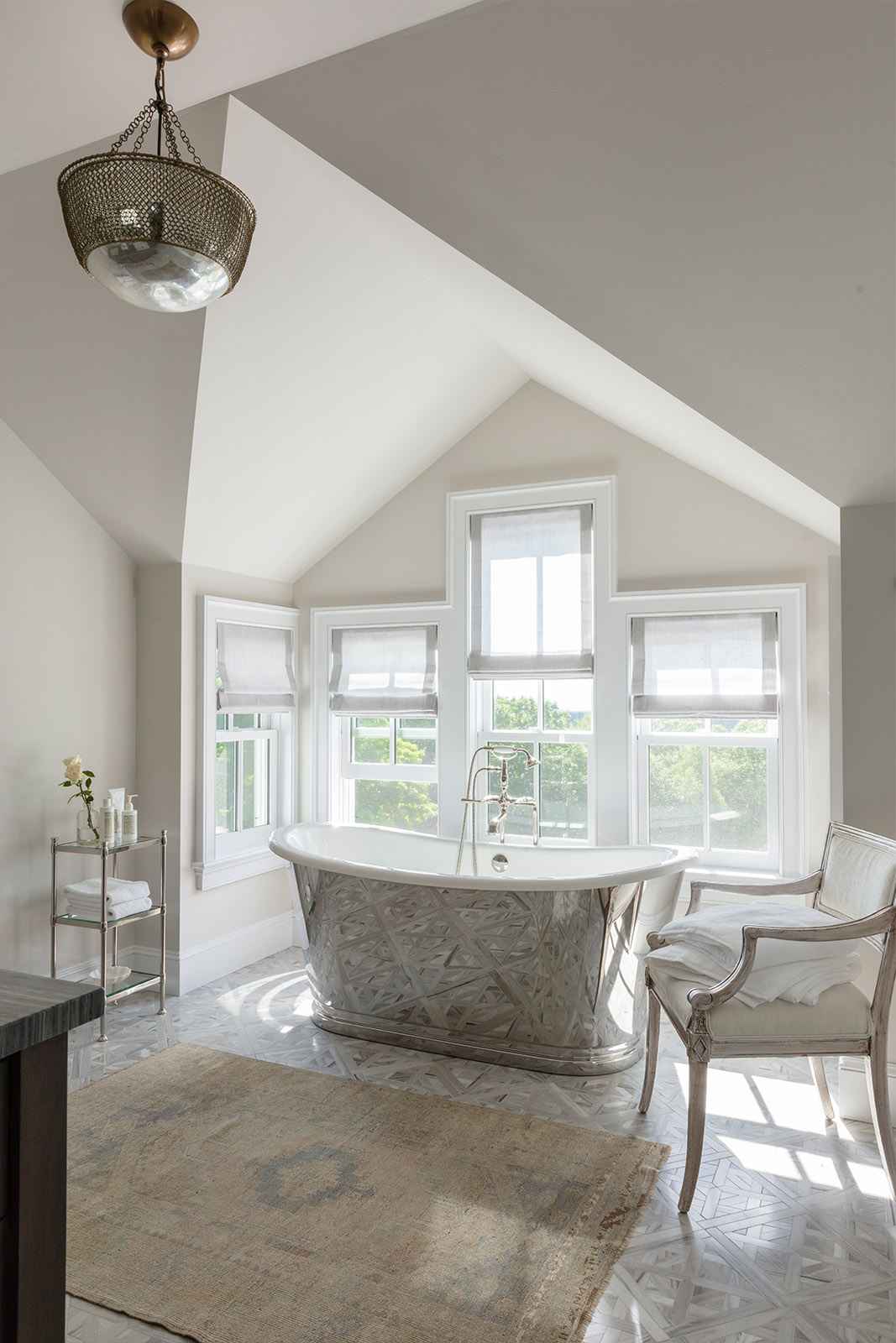
Architectural details play such an important role in the design of each room. In this master bathroom, the vaulted ceiling created the perfect backdrop for the metal surfaced soaking tub symmetrically centered on a bank of varying height windows capturing the beauty of the landscape beyond. The materials were chosen to give the bathroom a natural elegance with the medium toned wood vanity offset by the rich grey stone countertop and patterned tile floor. The vintage rug adds warmth and softens the space.
AFTER
AFTER
Children’s Rooms
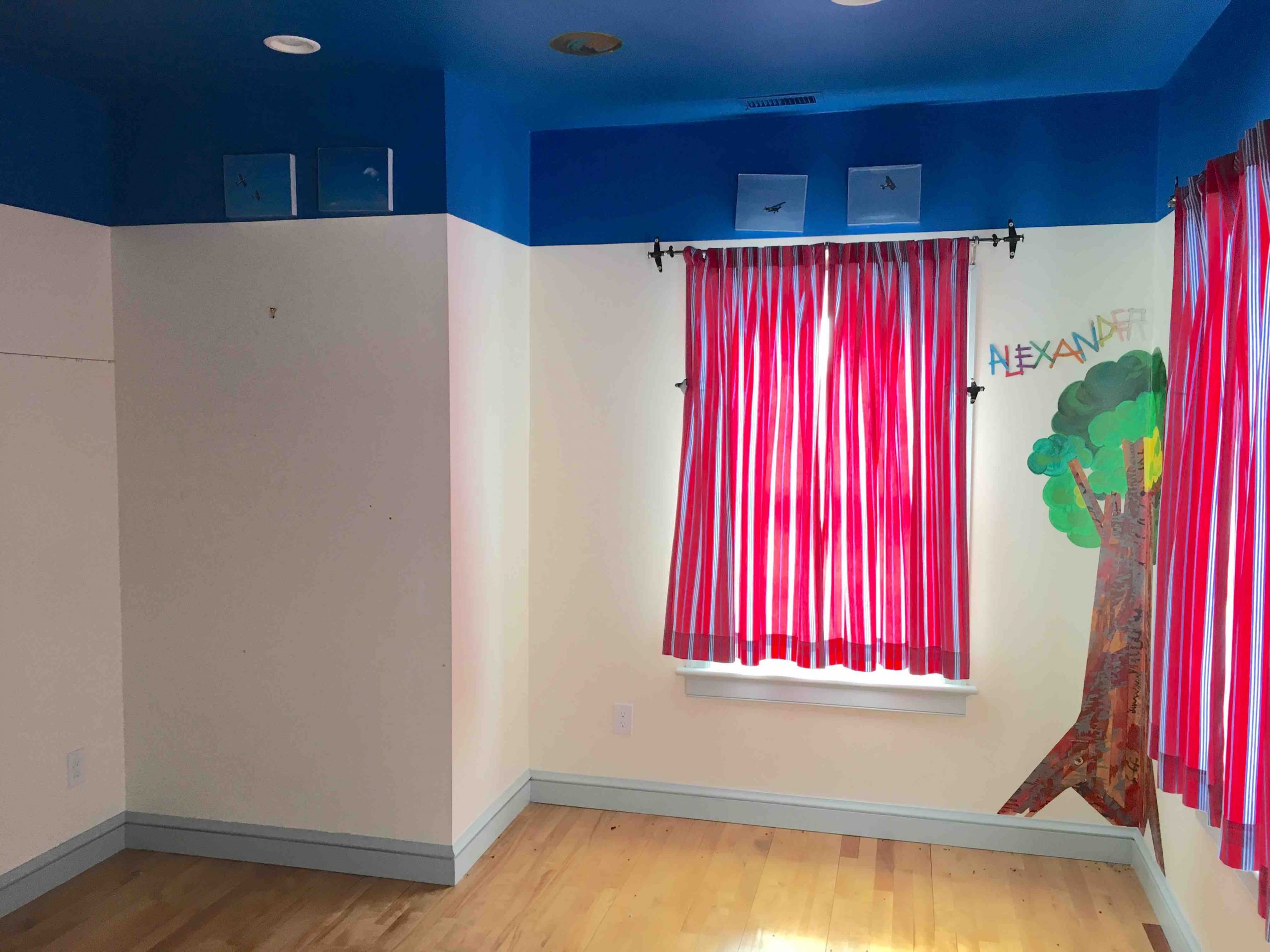
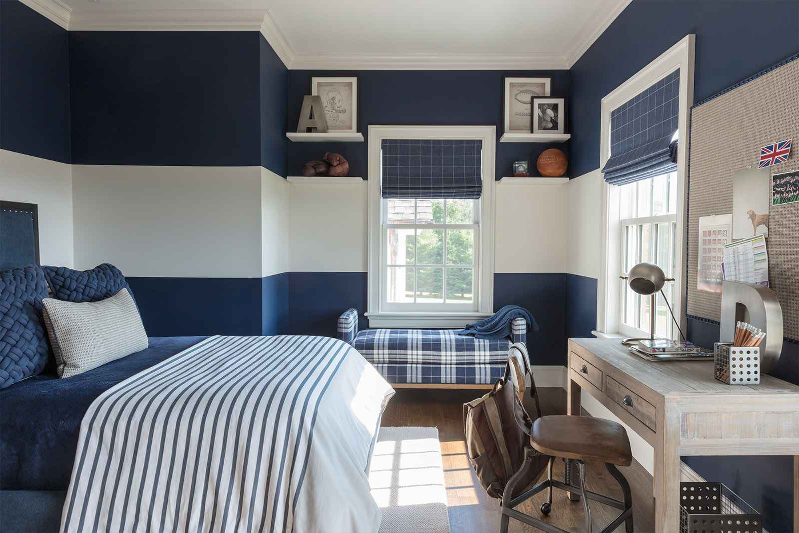
Meeting client’s expectations definitely includes the specific tastes of their children. In the two years we spent renovating and designing this home, the clients’ children grew up quite a bit. Keeping their specific requests for color and concepts in mind for their respective rooms was important as well as the intention of creating design styles that would continue to mature with each child. The three children have distinctly different personalities which were reflected in the color palettes and furnishing selections for these unique spaces.
BOY’S BEDROOM BEFORE
BOY’S BEDROOM AFTER
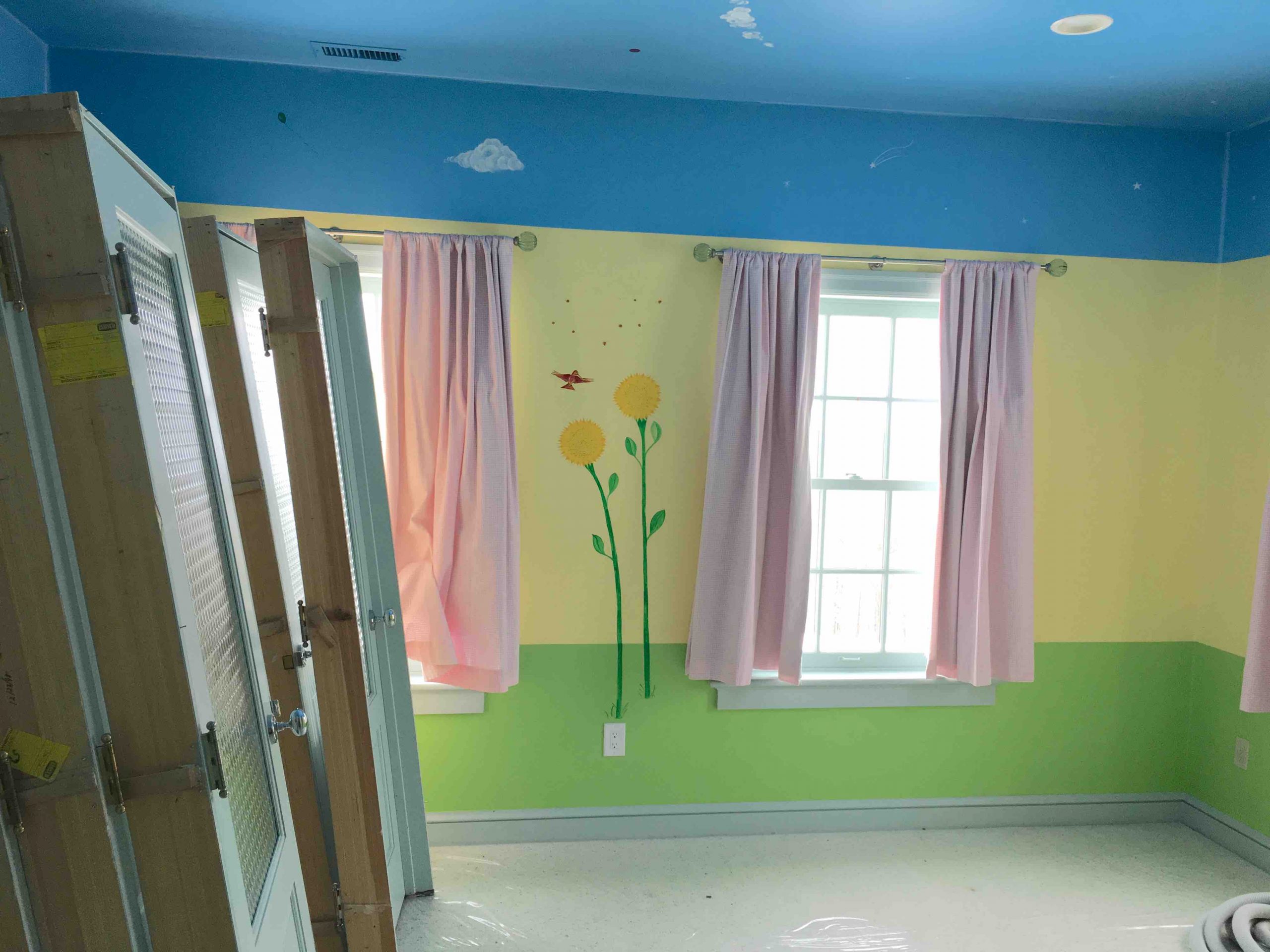
GIRL’S BEDROOM 1 BEFORE
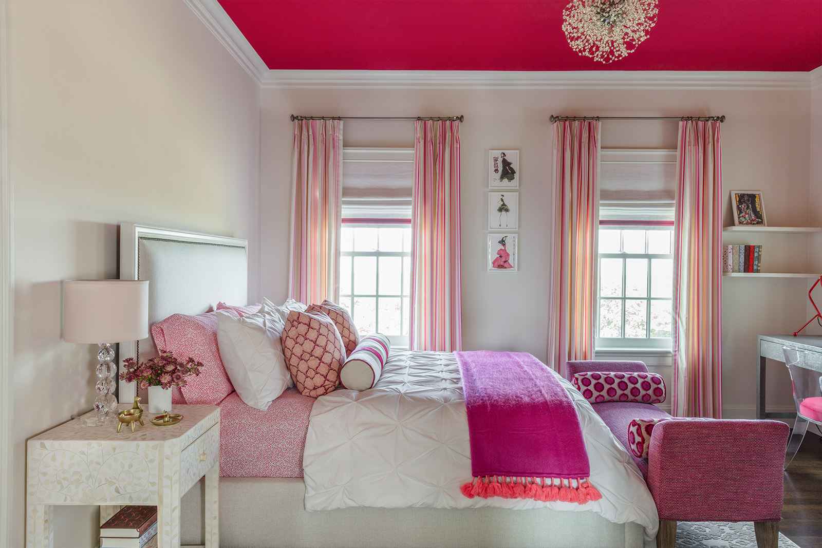
GIRL’S BEDROOM 1 AFTER
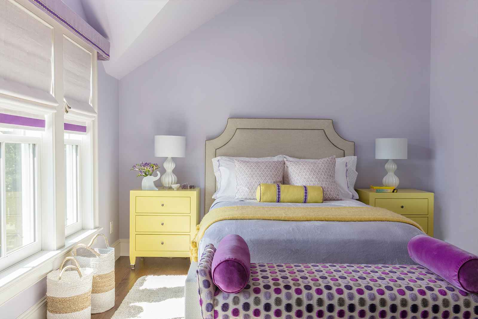
GIRL’S BEDROOM 2 AFTER
Art Studio
The essential elements of an artist’s studio are great natural light and unencumbered space. Situated on the 2nd floor, this area provides a refuge offering a clean slate to inspire the creative expressions of the entire family. We kept the walls white with the only visual elements coming from the expansive outdoor views and designed a custom table with a large workspace and open storage for art supplies. The painted white wood floor reflects the light into the space providing ideal visual conditions.

AFTER
3rd Floor Wetbar & Adjacent Porch
Finding the best use for unique spaces can be a creative challenge. The idea to transform the unused space on the 3rd floor to a wetbar came from our clients on one of our initial site visits. We designed this micro entertaining space to provide easy access for snacks and drinks which is adjacent to the roof deck where we added comfortable new seating to catch a brilliant sunset.
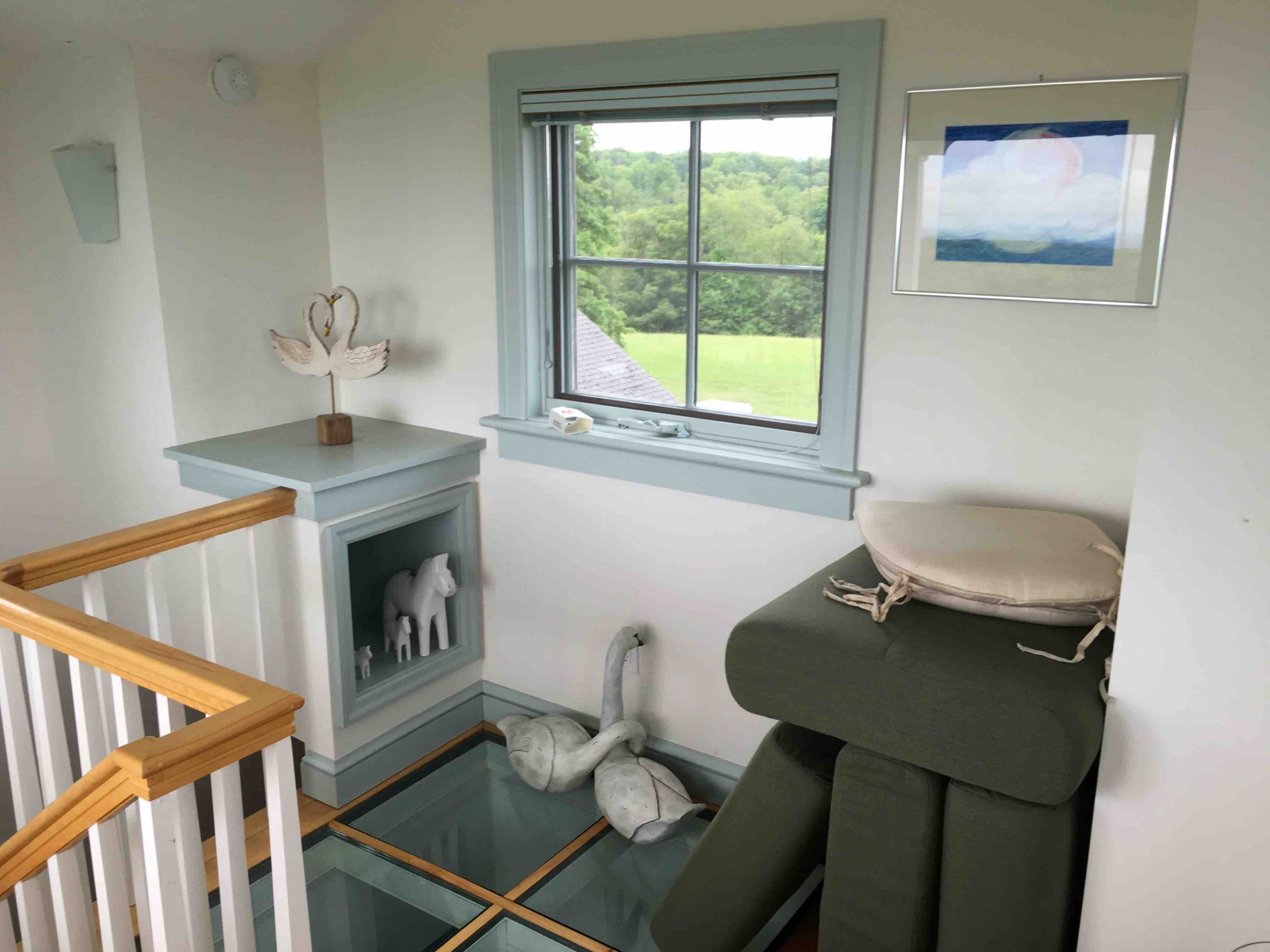
BEFORE

AFTER
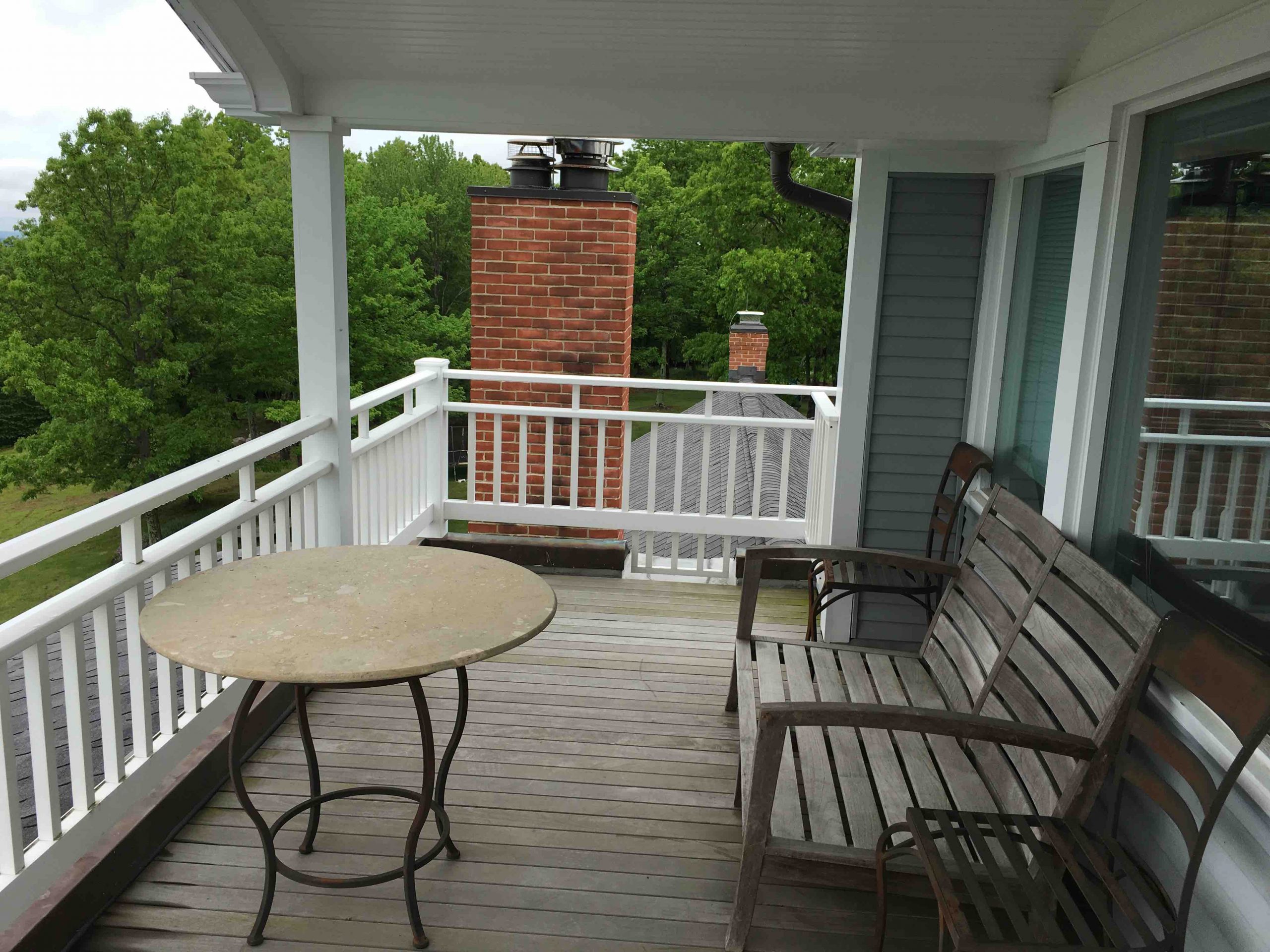
BEFORE

AFTER
Gym
A home gym can be as simple as a basic room with weights or it can be a dedicated space detailed to look like the rest of your home with well selected work-out equipment. For this gym reboot, we added natural oak wall paneling and used the same oak detail for the window and door trim. We installed rubber matted responsive flooring and designated areas for cycling, rowing, boxing, yoga and weight training.
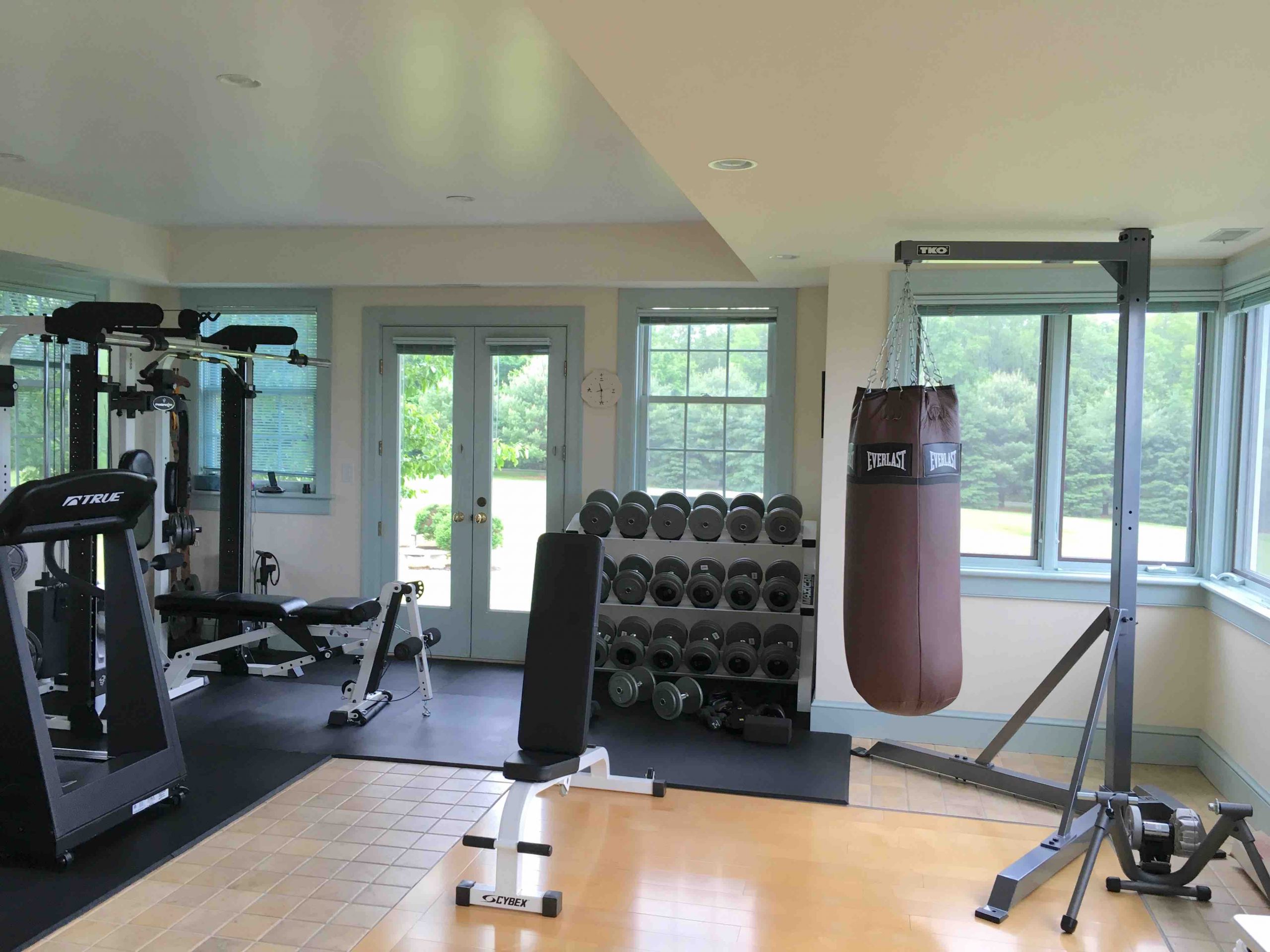
BEFORE

AFTER
Mud Room
A mud room was a “must have” for this athletic, outdoor family. This intentionally designed space includes durable wood parquet tile floors, custom storage for all sorts of sports equipment, hanging space for coats, cubbies for shoes and boots, and easy outdoor access.
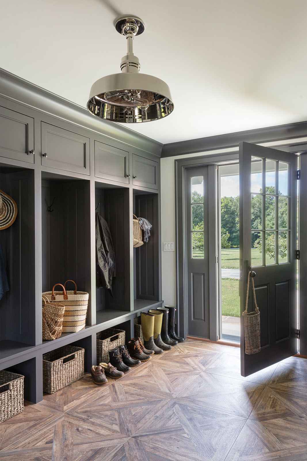
AFTER
Outdoor Spaces
Interior design is somewhat of a misnomer because not only should the spaces inside a home be thoughtfully designed but the outdoor spaces deserve equal attention in how they are used. This home offered various locations for outdoor living from the covered outdoor living room to the open-air dining patio to the serene porch featuring a super comfy swing. There is so much natural beauty to take in from each of these “rooms” and enjoying the outdoors is what this remarkable setting calls for.

AFTER
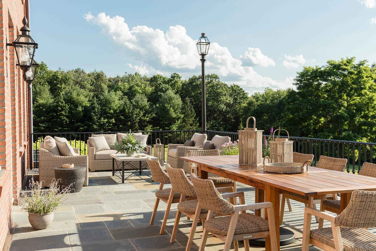
AFTER
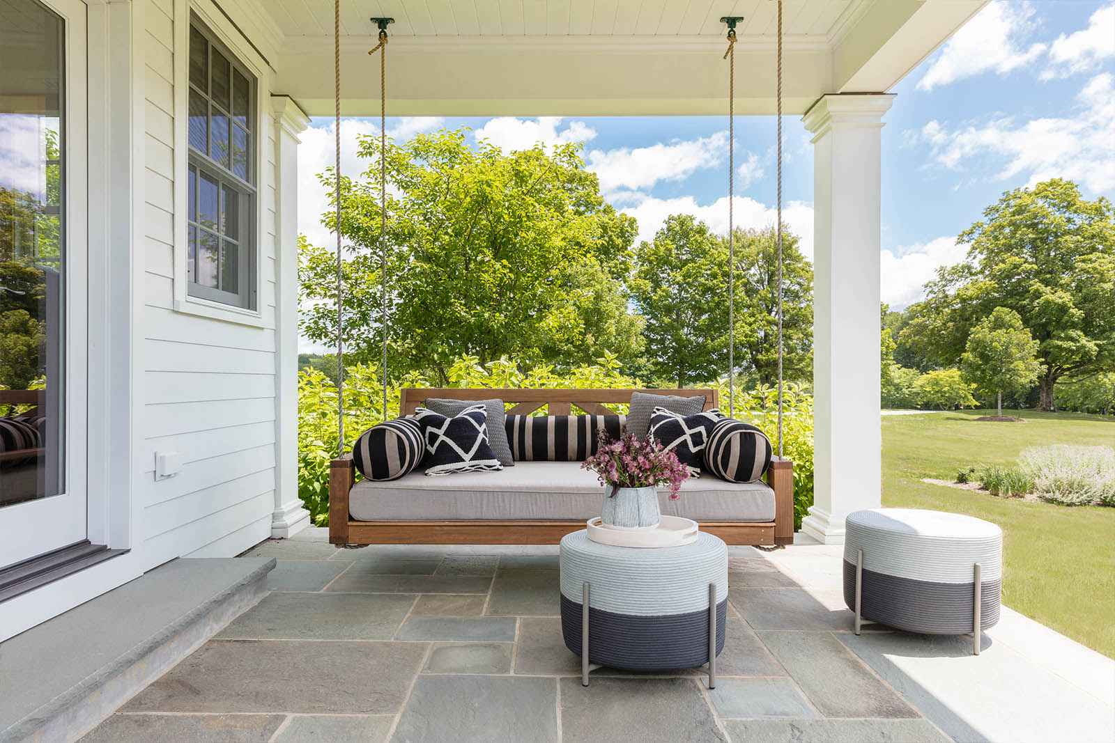
AFTER
I hope you enjoyed the tour of this truly special home. I leave you at one of my favorite spots – the crossroads leading to the Pig House and the Horse Stable – it is hard to decide which direction to explore first!

Best,

Photography: Antoine Bootz | Styling: Rebecca Omweg